Quick answer: Your website should tell a stranger three things within five seconds: what you sell, who it is for and what to do next. Use one plain headline, one supporting line and one main button. If a visitor cannot say what you sell after a quick look, the page needs rewriting, however good it looks.
Last week, in Is a cheap website worth it for a small business?, I said I would explain why someone takes one look at a website and thinks "nope". This is one of the biggest reasons.
I rewrote the top of my own homepage because it had too many words and looked busy. It was a good reminder that I am not the reader. My customers are.
| Question the visitor is asking | What they need to see | Where it goes |
|---|---|---|
| What is this? | The product or service, in plain words | Headline |
| Is it for me? | Who it is for and where you work | Supporting line |
| What do I do next? | One clear action | Button |
What counts as the top of a website?
The top of a website is whatever a visitor sees before they scroll. It is often called "above the fold", which is a newspaper term for the half of the page you could read without unfolding it.
This is where a visitor decides to stay or leave. They do not read it like a book. They glance, and they either understand it or they do not.
Can a website look great and still sell nothing?
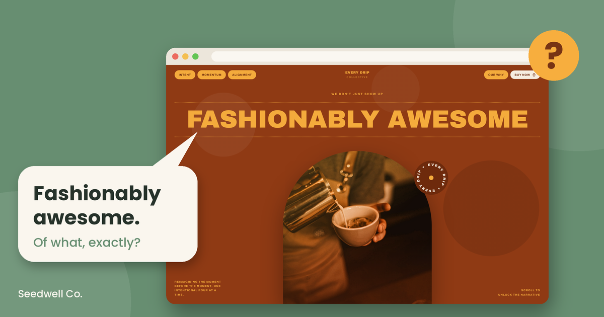
Yes, and it is easier than it sounds. To show you, I built a quick fake website for a coffee company that does not exist. I based it on the style of several real websites I have seen, so nobody gets singled out. It looks lovely. Here is the top of it. Read it and tell me what it sells.
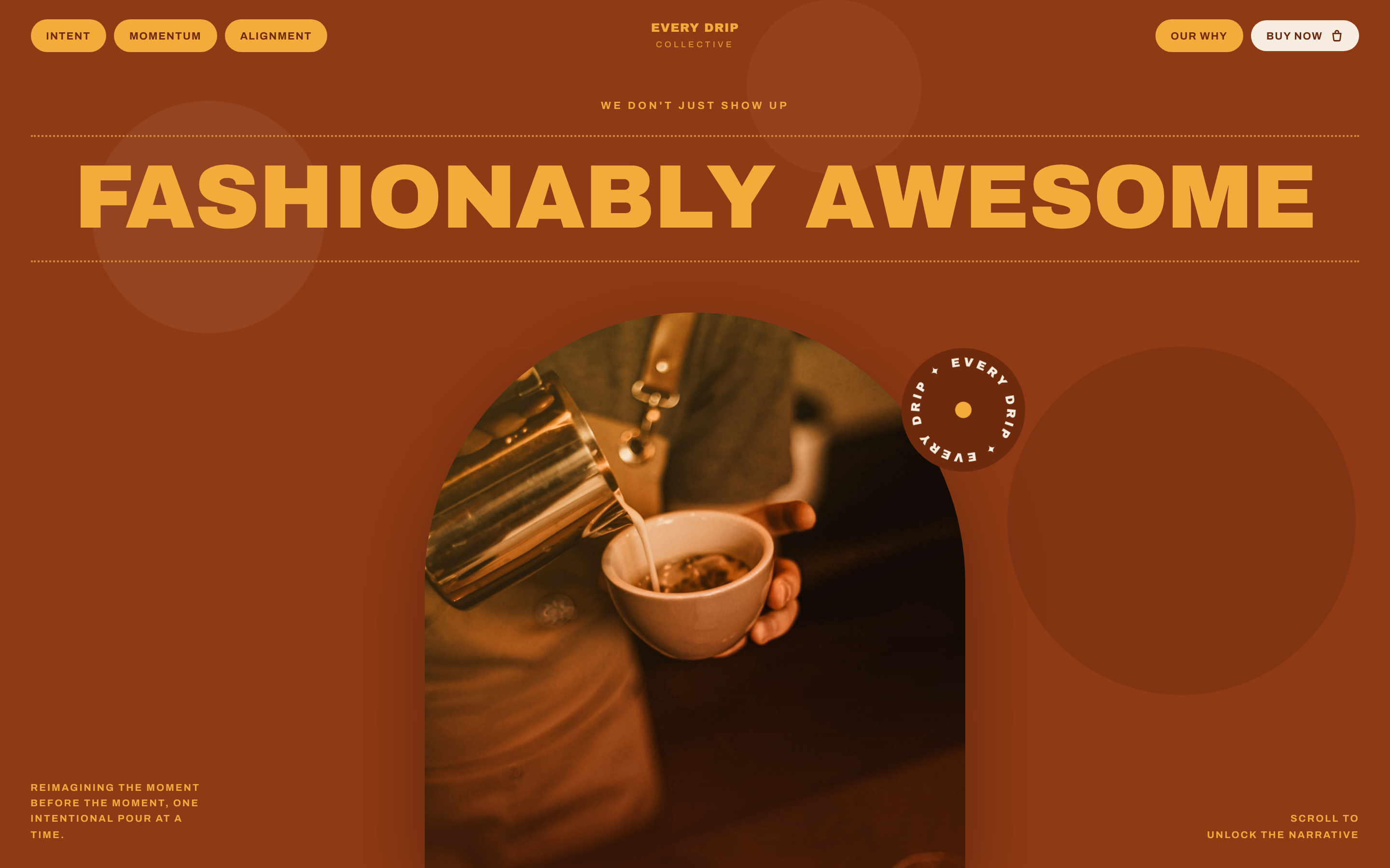
Menu: Intent, Momentum, Alignment
Eyebrow: We don't just show up
Headline: Fashionably awesome
Supporting line: Reimagining the moment before the moment, one intentional pour at a time.
Buttons: Our why, Buy now
Times the top says what it sells: zero. Buy what? Intent? Momentum? Alignment? A visitor could leave thinking it sells a leadership workshop, a yoga retreat or a very expensive pillow. The photo hints at coffee, but a photo is a hint, not a headline.
So I scrolled. Here is the bottom of the page.
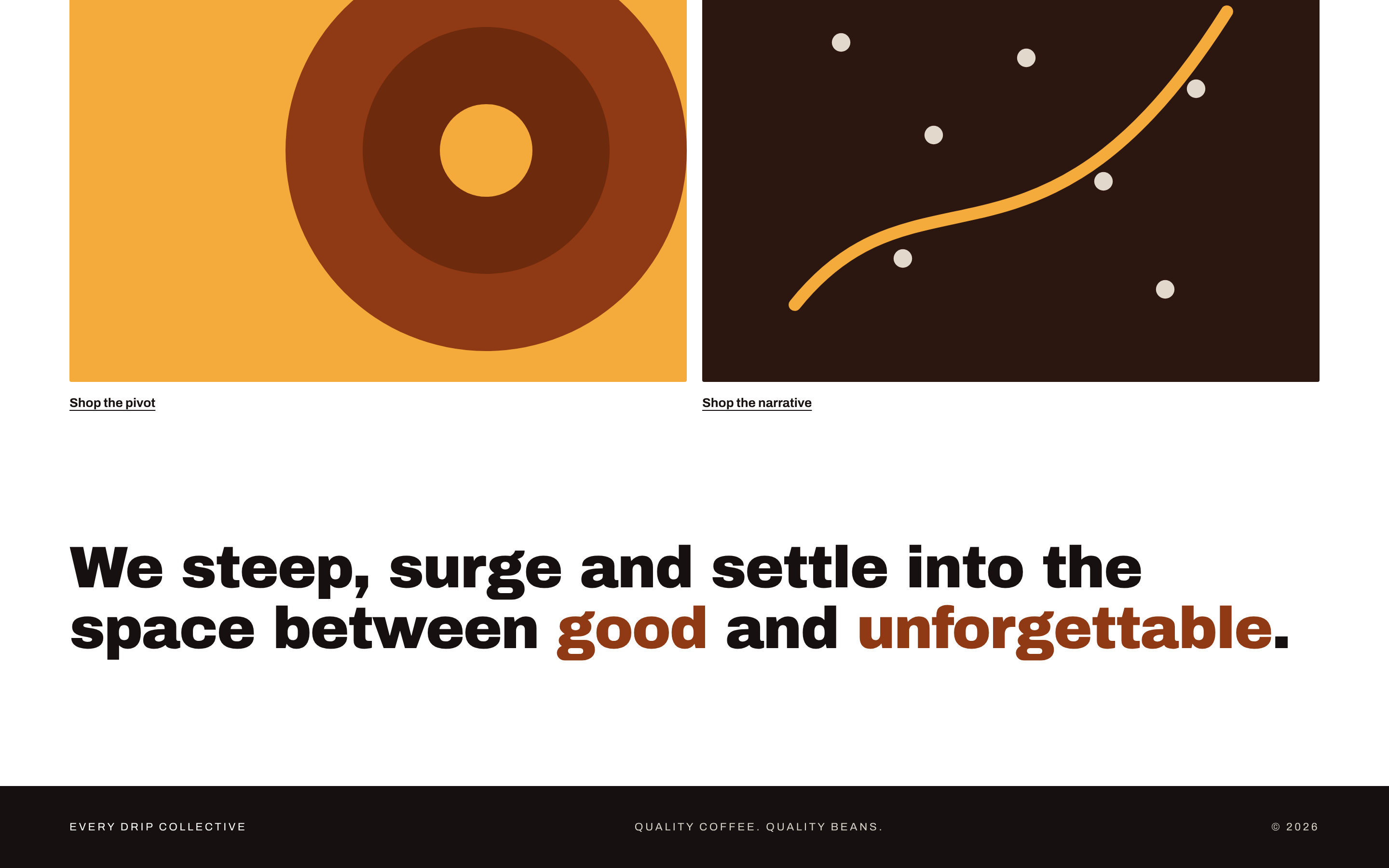
There is a lot going on down here. You can "Shop the pivot" and "Shop the narrative". We "steep, surge and settle into the space between good and unforgettable". (Somewhere, a designer is nodding.)
Times the page says "coffee": once, in the footer, in small capital letters, next to the copyright year. Times it says the price, the size of a bag or what a pivot costs: zero.
That is the problem with a beautiful website that nobody wrote for a stranger. It looks like a brand, and it works like a mood board. And even if you knew it was coffee, which coffee? Beans? Ground? Drip bags? Is it a roastery or a café?
What should the headline say?
The headline should say what you sell, in the words your customers use. Write it as a plain sentence: who does what, for whom.
That is a subject, a verb and an object, and it works for people and search engines at the same time. For example: "Seedwell Co. designs websites and manages local SEO for small businesses across Sydney." Nobody has to decode anything.
The other half of this is word choice. Customers search "physio near me", not "holistic movement solutions". Use the words they type, because those are the words they will understand.
This is also where a clever line can go wrong. A clever headline is fine if a plain line underneath says what you sell. "Fashionably awesome" on its own is a riddle.
What did I change on my own homepage?
My homepage had too many words and too many things to look at. I cut it down to one headline, one supporting line and two buttons.
The headline now reads: "Websites that welcome people in, and local SEO that brings them to the door." The supporting line underneath says that Seedwell Co. designs websites and manages local SEO for small businesses across Sydney, and that it is run by me from Epping.
I also took a button away. It needed an explanation, and a button that needs an explanation is doing the opposite of its job.
If the top of your website needs a rewrite and the rest of it is not working either, this is the kind of job Website Rescue is for.
Simplicity is key. People only have so much attention to give, so make your words count.
What should the button say?
The button should say what happens when someone clicks it. Use a verb and the thing they get.
"Shop coffee beans" works. "Book a free 15-minute chat" works. "Begin the journey" does not, because nobody knows where the journey goes or how long it takes. "Buy now" is better than that, but it still leaves one question: buy what?
One main button is plenty. Two is fine if one is clearly the main one. Three is a menu pretending to be a button.
How many words should the top of a website have?
As few as it takes to say what you sell, who it is for and what to do next. A good test is whether you can read it aloud in one breath.
Most small business websites have the opposite problem. The owner knows the business so well that every word feels important. It all matters to you. To a stranger, it is a lot of text.
How do I test the top of my website?
Use the five-second test. It takes about ten minutes to set up.
- Find a stranger, or close to one. Family and staff already know what you do, so they do not count.
- Show them your website for five seconds, then take it away. Do it on a phone, because that is where many people will see it.
- Ask what you sell and what they would click. If they cannot answer both, rewrite the top.
Then read your headline and ask the three questions from the table. What is this? Is it for me? What do I do next? If one of the answers is missing, that is the next thing to fix.
Common questions
What does "above the fold" mean on a website?
It means the part of the page a visitor sees before they scroll. The term comes from newspapers, where the top half of the front page was visible when the paper was folded.
How long should a website headline be?
As short as it can be while still saying what you sell. If you cannot read it aloud in one breath, shorten it.
Should I put my suburb or city in the headline?
Mention where you work once, near the top, in plain words. It helps visitors know it is for them, and it helps search engines understand where you operate.
Can a website headline be clever?
Yes, as long as a plain line underneath says what you sell. If the clever line is the only line, visitors have to guess.
The short of it all
Final tally. The fake website said what it sold zero times at the top and once at the very bottom. The fixed version says it in the first three words.
Headline: Specialty coffee beans, roasted in Sydney and posted fresh to your door.
Supporting line: Choose your roast and bag size. We do the rest.
Button: Shop coffee beans
It is not poetry. It does sell coffee beans, which is the point of the website.
If the top of your website reads more like the fake one, start with the five-second test. If it fails, Website Rescue is where to start.
Dave Tran runs Seedwell Co. from Epping in Sydney, building websites and local SEO for small businesses.
Findability Audit · $599
Not sure where to start?
A Findability Audit gives you a plain-English picture of where you stand online and the first three things to fix.
Fixed price. Pay once. Report is yours to keep.